
How Does Embroidery Work?
Embroidery is a decorative technique used to create designs on fabric. This technique involves the weaving of thread to create shapes and words. Embroidery looks elegant and is distinguishable by it’s raised and textured qualities.
If you are using Printaura for your embroidery work, the steps are as follows:
- First, you will need to download one of our embroidery templates - found under the artwork requirements tab of the embroidery page.
- Next, you will need to add your design to the art space provided, using the color swatches provided. The colors provided in the template represent the colors of thread that are available for embroidery.
- You then send your design to us to have it digitized.
- The digitizer converts your images into a language that is readable by the embroidery machine.
- The digitized image is sent to the embroidery machine.
- The embroidery machine uses the colors of threads specified in the shapes and fonts you have chosen to embroider your design on a product.
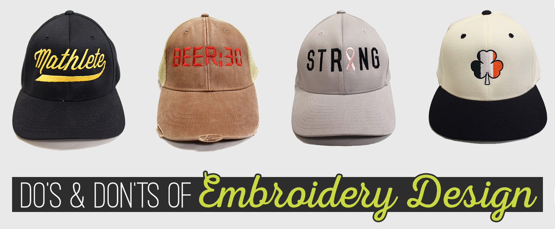
Do’s and Don'ts of Embroidery Design
Creating a design for embroidery can actually be quite difficult. It’s much different than direct to garment printing and screen printing. Since the design is being sewed on, there are some design limitations that need to be taken into account. Certain shapes, details, and fonts, are too complicated or nuanced to be created using thread. Here are some do’s and dont’s to help you create a great embroidery design.
Using The Embroidery Template
There are several things that need to be taken into consideration when adding your artwork to the embroidery template. Here are some tips to help you stay on track:
Do
Consider the size of the artwork space. The artwork space is only around 5 inches wide and 2 inches tall. If you want a discernible design, make sure to use the entire height of the space.
Use the color swatches provided at the bottom of the template. These colors represent the colors of thread that are available.
Consider contrast when choosing colors. For example, use dark colors on light hats and light colors on dark hats.
Use simple shapes.
Don’t
Use a small amount of the artwork space provided. If you only use half of the height of the space provided, your design will only be around 1 inch tall.
Use colors other than the colors provided in the template.
Use similar colors to the color of the product you have chosen. For example, don't use black, dark gray, or dark blue on a dark hat.
Use overly complex or detailed shapes.
Use shadows or shading.
Use color gradients.
Put large outlines around your designs. The outlines take up a huge amount of your allotted thread count.
Use photographs
Choosing Fonts For Embroidery
Choosing a font for embroidery can be difficult. Many fonts that look great when printed might not translate well for embroidery work. Here are some tips to help you choose fonts that will come out great:
Do
Choose a sans serif font
Choose an easily legible font.
Choose a font that has a decent amount of space between characters.
Choose a clean font without distressed or stylistic features.
Choose a font that is at least ½ inch high.
Stay within the thread count guidelines.
Don’t
Choose a font with pronounced serifs
Choose a hard to read font.
Choose a detailed font.
Choose a font with distressed or stylistic features.
Choose a font that has letters very close together.
Choose a font that is under ½ inch.
How To Prepare Art For Embroidery
Sometimes seeing is better than reading! If some of these do's and don'ts seem a little hard to understand, check out our video! We've created a how to video to show you guys how to get your artwork ready from embroidery.